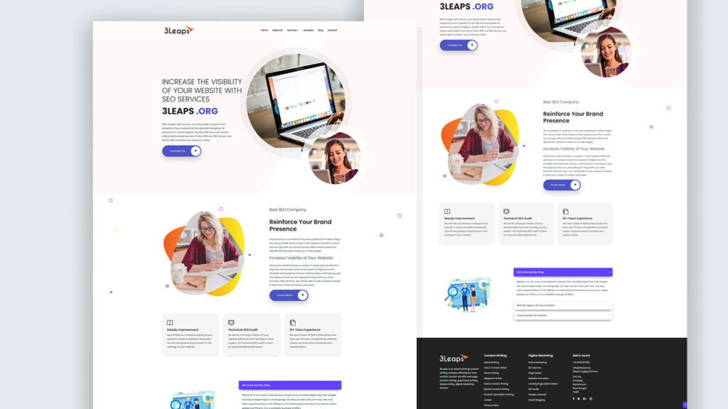
This design was for an Content Marketing agency that wanted to stand out without trying too hard. We kept things clean but gave it some personality using rounded visuals, soft gradients, and little color splashes that break the usual mold. The homepage leads with a straight message—no buzzwords, just what they do and why it matters. Then it flows into sections that explain value without overloading the reader. Every element’s spaced out enough to breathe, and there’s zero distraction when someone’s ready to click.
Built on WordPress with a fully customized Elementor setup, this one was structured so the client could tweak their service blocks and lead forms without touching any code. It’s responsive across all screens and the layout sticks to a logical visual rhythm, which keeps bounce rates low. Also, the CTA placements were tested in multiple spots before we locked it in—conversion was the whole point here, and every section plays its part.