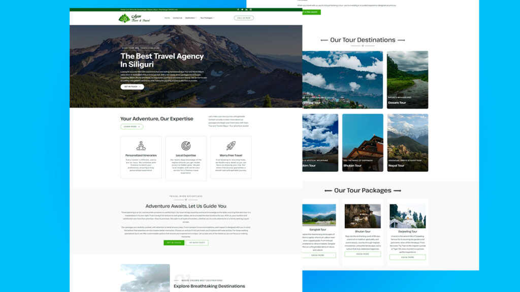
This one was built for a travel agency based in Siliguri that wanted something clean, bold, and straight to the point. We kept the top section focused—strong headline, scenic background, and a call-to-action that doesn’t waste words. Then we added clearly labeled tour cards to let users scan fast and pick where they wanna go next. No clutter, no fluff. Just useful layout choices that guide clicks the right way.
The backend runs on WordPress, and we used Elementor so the client could update tours on their own. Every image was compressed right to balance quality with load speed, and the grid system made it easy to keep everything mobile-friendly. The client needed something they wouldn’t break with a simple edit, so we baked flexibility right into the build. Just a solid, conversion-focused travel site that actually works.